
Recap: 3/23/16
Hosted by LWD member Kate MacKinnon at ZGF
Date Visualization:
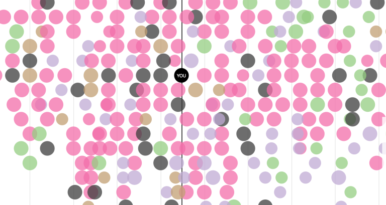
Member Kim Feinberg led an engaged conversation on data visualization. Kim is a finance professional turned report writer, data visualizer, business analyst, and information designer who’s passionate about data and the power it has to drive decisions and influence change.
We discussed quantitative vs. qualitative numbers and how they can speak to you as a designer. The holes that can exist in qualitative data and how qualitative date has higher standards.
Member Jessica Wallace discussed current age demographics being studied in this way and how quantitative data can fail when you don’t have access.
Also discussed, ethics and what to do with information —-> the more transparent the better.
This specific project Kim felt showcases the power that data visualization can have as you scan in closer to reach the individual story. Also highlighting that Portland based company Pariscopic leads with “Do Good With Data”
Other resources Kim mentioned:
www.informationisbeautiful.net
The Best American Infographics
Graphics to Enhance Environmental Experience:
Our invited guest Marilee Sweeney shared a recent completed project for LA based coffee house Cafe de Leche’s new location in the Mt. Washington neighborhood of LA. We discussed the straight forward simplicity that font and graphics can have and what inspired the direction of their site specific graphics. We also discussed how environmental design forms a users perspective.
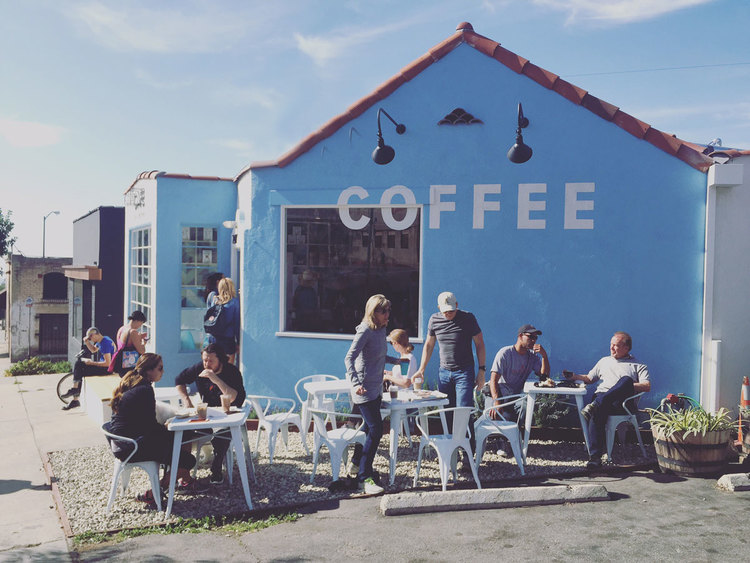
Photo showing the hand painted signage outside the building.
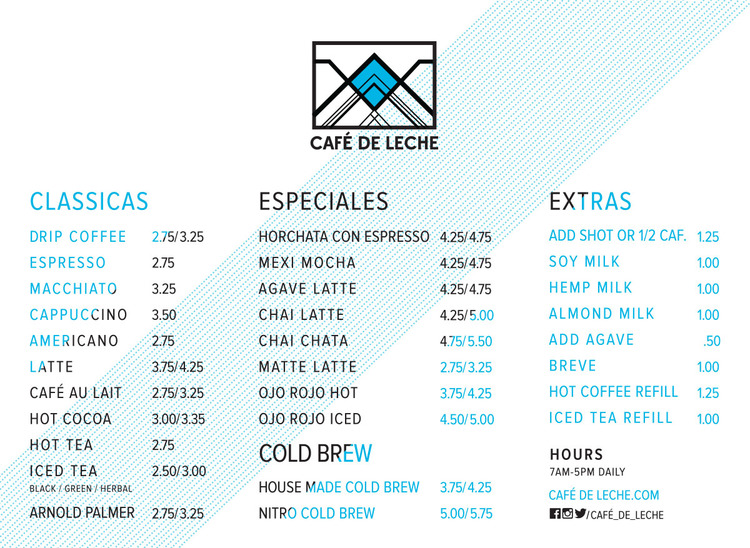
*prediction, horchata latte’s will become popular in Portland soon.
