
Recap: 5/15/18
Hosted by LWD member Arielle Weedman, co-owner of Weedman Design Partners
We welcomed guest Kristin Van Buskirk to share her expertise and passion for color with us and discuss current trends in color design and research.
Kristin is co-owner of Portland-based design shop Woonwinkel. She previously worked in color design at Nike for 23 years. A temp job at Nike led her into this niche of a career that she naturally excelled at after a background in fine art. In the 23 years at Nike her intuitive talent towards color decisions moved her from Junior Color Designer, to working on color at the product level, and finally guiding color across collections as a Color Design Director for six years.
Kristin gave a beautiful presentation and left us with a lot to think about, get excited about and learn more about. Color is the first thing people notice. Color attracts the eye – people make their first judgment about something within 90 seconds after seeing it, and 60% of that judgment is based on color.

Retail:
In apparel and retail seasonal colors need to create an impression of “newness”. Humans crave newness; so just changing the color of a product can reach new consumers, potentially saving money on developing new products using color instead of new tooling. Color creates the impression of newness, while making the least amount of change. New colors can flow in and out of a retail space, and strategizing that turnover was a good design challenge for Kristin every season at Nike.
Four simple tenets of successful color design:
- Color Makes a Statement
- Color Connects
- Color Evolves
- Color Inspires
Color Makes a Statement:
Look at brands like UNIQLO, with products that offer basic silhouettes but the opportunity to express individuality through color. Color can make different statements – forming the foundation of a brand which is seen more often or the pinnacle achievement of a brand that is more aspirational and used more rarely (think of a pyramid shape of color with the foundation at the wide end)
Color Evolves:
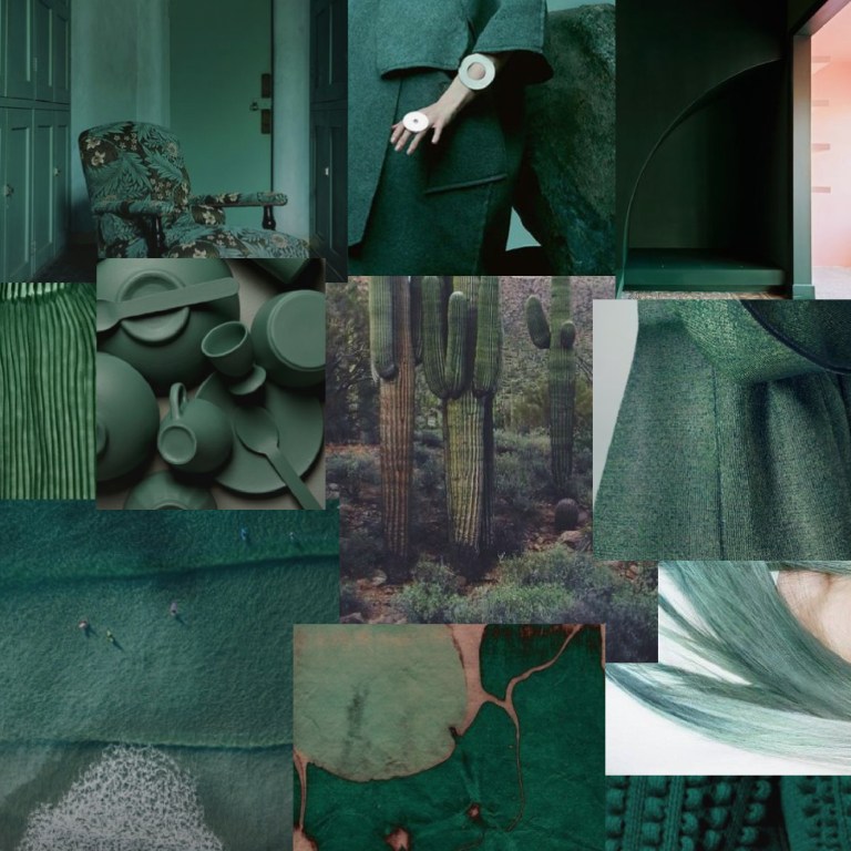
Color evolves with the seasons. Fall and Winter seasons always bring deep and rich tones, with some sparkle for the holidays. Spring is an opportunity to cleanse the palette with colors like navy, and create a blank slate to build on for the year.
Color Connects:
At Nike, Kristin obsessed over data – what colors were selling the best? Not that it necessarily guides you on what to do next, but to understand the trends.
Macro trends (long term) + Industry trends (influencers) = Consumer trends (driven by the educated consumer)
Designers need to absorb inspiration out in the world, looking at real colors, doing the research and looking for inspiration.
Color Inspires:
Color can make the ordinary extraordinary. For instance, changing the color of an ordinary object to something unexpected. At the Nike Colorhouse, they test the application of colors to different materials, creating standards for manufacturers, working to make colors actually match in execution.
One of Krisin’s major talents is in color forecasting, similar to trend forecasting. It’s hard to quantify and predict, as it can be an intuitive process. Many people work on the art of color forecasting, including organizations like the Color Marketing Group . One tip is to look at industries that create products with more longevity, like cars, to see the color trends that will be part of the visual landscape longer.
Kristin found herself wearing all black at Nike, although she loves color, because professionally she wanted to present herself as objective, not picking colors because she had a personal color preference about the projects or showing her cards of colors she was forecasting for the upcoming season.

Kristin finds a lot of inspiration from dutch design. Because of ingrained support for design and art, it is much easier for dutch designers to play with color, they can be more conceptual and take risks.
One of her favorites, Dutch Designer Hella Jongerius, combines color design with large scale industrial processes and the touch of the human hand, even just the illusion of handwork.
Hella also successfully conquers the “purposeful mismatch” in her Polder Sofa design , a concept Kristin is greatly inspired by.
 You can see the trend of “purposeful mismatch” in color and texture in clothing brands like Stone Island as well.
Thinking about the environment the color will be in:
When figuring out how to use Nike color Volt, they tested different options to find out how to use that color to stand out on the rich blue of the Olympic track, especially compared to other brands. (Read more about this design thinking and strategy here)
Another color environment to consider is skintone, with so many variations. (Look at the work of Angelica Dass, who has photographer hundreds of people and created Pantone color matches http://humanae.tumblr.com) At Nike, Kristin looked at the Nike core colors on a variety of skin colors, photographing those products on a diverse set of bodies. This project was part of the persuasion process to actually evolve the core colors for the first time in years.
The application and proportion of color makes a big difference. For instance, in the Spring 2016 Running collection, they were able to shift to sporty colors away from the bright Nike neons, with the use of a lot of white with pops of colors.
Some of Kristin’s proudest moments as a Color Director was to actually dial back the use of color to refine the application. A limited palette does not have to be limiting. When using fewer colors, you just have to get the right color.
A Color Director first has to build a case internally with the team, then demonstrate that to the executives. 90% of the job is diplomacy and persuasion.
Although Kristin had moved out of a design position and into director position at the time of the Nike Flyknit release, she was and is excited about the infinite color and texture possibilities.
Lets talk about Grey / Gray:
We talked a a lot about colors with staying power like Black / White / Grey – How Millennial Pink seems to have more staying power then originally predicted and maybe one reason for this is how well it can pair with Black / White / Grey. She referenced the staying power of 70’s color Avocado, which eventually made it into the mainstream in sinks, refrigerators, a big testament to its staying power through that decade.
What is next for color trends:
Colors now being designed to look good on instagram like this recently released Adidas sneaker Deerupt – http://www.core77.com/posts/75276/adidas-Recently-Released-Sneakers-Designed-to-Look-Good-on-Instagram
Q&A:
What is the color test that designers have to pass?
The Munsell Hue Test – arranging colors form yellow-green to green-yellow. It’s challenging. Did you know that women have better color acuity than men?
What does Kristin look for when buying for Woonwinkel?
Color and texture. Interesting use of materials. Finding simple objects in the perfect color and texture combination.
What’s the main source of current inspiration for Kristin?
Being outside, no music, just that rare quiet moment -“black in the brain” – space for inspiration and ideas.

*image – Hay’s Perforated Trays – available at Woonwinkel
Further Reading / Color Deliciousness:
-Raw Color – http://www.rawcolor.nl/welcome/
-Dan Lam – https://www.bydanlam.com
-Scholten + Baijings – http://www.scholtenbaijings.com/
-Hella Jongerius – http://www.jongeriuslab.com/
-Angelica Dass – http://www.angelicadass.com/humanae-work-in-progress/
-Angelica Dass Ted Talk – https://www.ted.com/talks/angelica_dass_the_beauty_of_human_skin_in_every_color
-Woonwinkel Pinterest page – https://www.pinterest.com/woonwinkelhome/boards/
